| |
Infographics poster
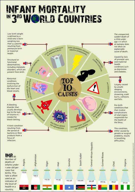
The idea of an infographics is to communicate complex data into information that can be easily understood in visual forms. Using publicly available data or social awareness issues, Phang Su Hui chose the topic on infant mortality in 3rd world countries and created an A2 poster.
These sites were referred to for ideas:
http://www.coolinfographics.com
http://columnfivemedia.com/work/
http://www.hongkiat.com/blog/50-informative-and-well-designed-infographics/

Infographic poster

Chan Jing Hao used colony of ants to represent the types of government in the world. Colors of the types of government are color coded to match the descriptions in the "pop up" box.

Infographic poster
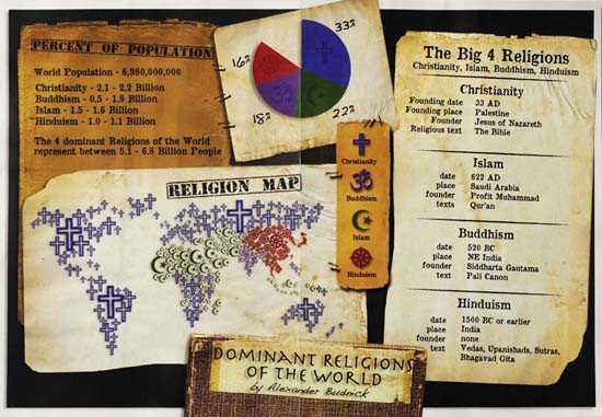
Alexander Jordan Budnick, a communication studies exchange student from Canada combined his computer skills in Illustrator where he created the religion map on the lower left of his composition well manual ones where he appropriated images of old papers and rearranged them into sectional portions to display information about the dominant religions of the world.

Typographic CD Sleeve
The students of COM 232 were tasked to design and fabricate a mock-up removable sleeve to cover an individual jewel case for a CD set of music intended for meditation. Using typographical patterns, their design must reflect the soft, repetitive and soothing music and sounds designed for relaxation, stress relief and meditation. The CD shall be named "Paradise".
The back of the CD should include text describing the contents of the specific CD. The back of the CD should have an area reserved for a bar code and other "small print" such as the running time (approximately 2 hours per set), copyright info, etc.
Music and the visual arts have many common things: rhythm, harmony, and tone. These can be expressed via line and shape (for rhythm)in a given space, scale and texture for harmony and tone. Since this is a CD for meditation, some meditative musics were played for the students to draw some abstract, non-representational forms of lines or patterns to get a sense of the music with the hopes that their subconscious shall take over...
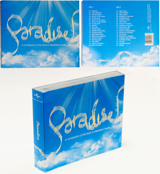
In researching for the assignment, Keith Kay Jin Rui found that words that kept popping up in her Google searches were "peace, calm, heavenly, relaxation, zen and tranquility". It was in the direction of these words that he tried to steer his project towards. As a finishing touch, he added in rays of sun to fill up the block of blank space at the top of the image as well as to give it a "heavenly" feel which borders on a religious feel. He believes that the purpose of meditation is to bring one to a calm state where one can become one with nature and inner peace.

Typographic CD Sleeve
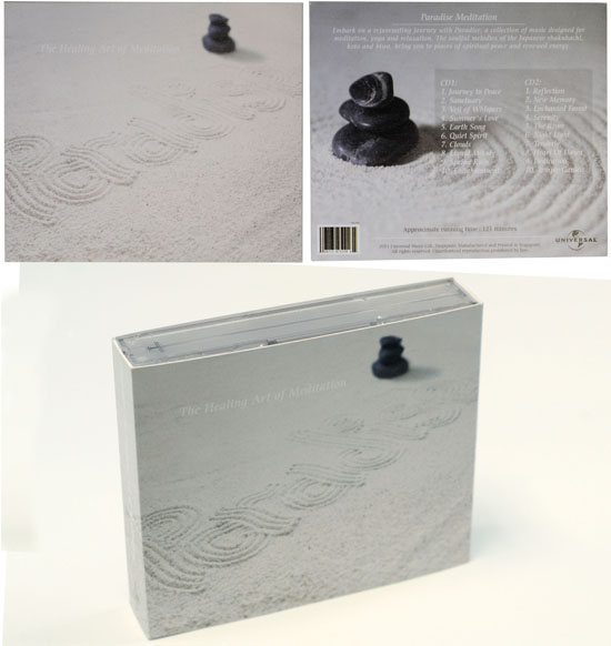
To Chin Yi Xin, less is more. She explored the idea of a Zen garden as she felt that its simplicity epitomizes the concept of relaxation. She found pebbles of varying sizes, purchased sand and created a Zen garden on her own. The word "Paradise" was created using 3 toothpicks attached to an ice-cream stick. Then, she photographed the word from a diagonal angle as she felt that this will ease the yes of the readers, whereas, photographing it from a bird's eye view will make the word less dimensional. She ensures that the necessary information, font, placement of elements and color enhances the overall sense of relaxation. The spines were kept simple to suggest a sense of continuity as the image of the word "paradise" spills onto both sides. The back of the CD sleeve features a close up of stacked pebbles.

Typographic CD Sleeve
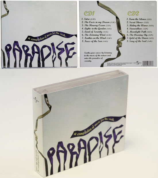
Using ribbons to form the word "paradise", Candy Tan Hui Shi also added a silhouette of a human profile for a more humanistic feeling. After creating the words, she photographed them and removed the background in Photoshop. Throughout the course, she attempted with many different colors for the background such as dark blue, pink, beige, etc. She realized that dark blue made the words seemed eerie and creepy. She added a tagline on a ribbon and ran it horizontally across the cover, just above the word "paradise". This is to lead the movement of the eye towards the side spine.

Tessellated postcards
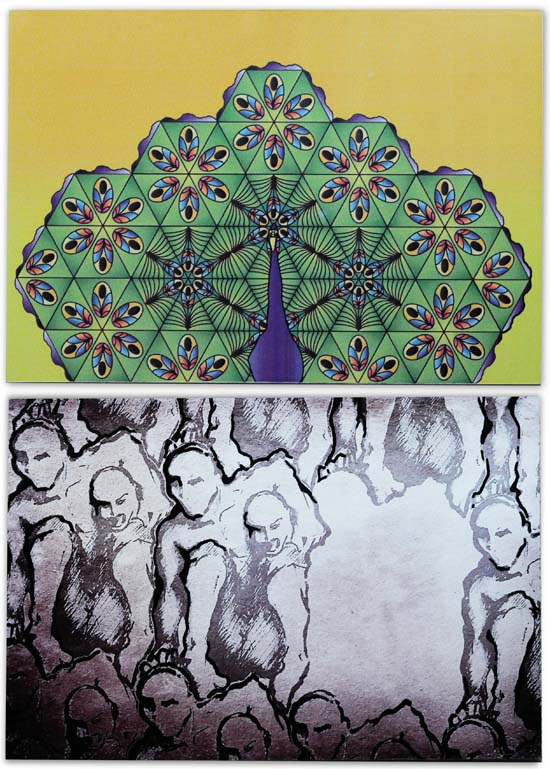
When figures are repeated alternately with ground without overlapping, it is called a tessellation. The word 'tessera' in Latin means a small stone cube. They were used to make up 'tessellata' - the mosaic pictures forming floors and tiling in Roman buildings. Dutch artist M C Escher (1898-1972) created some of the most interesting tessellations.
Graphic Communication (COM 232) students created these 4" x 6" double-sided postcards with postal information. They further applied their knowledge of figure and background information and use tessellation with visual images that contradict yet complement each other. Since the figures are repeated alternatively with the background, we are able to see the background as figures or the figures as background. For more descriptions about Tessellations, visit http://www.tessellations.org/tessellations-all-around-us.shtml
I wish to thank Prof. Ravi Poovaiah for sharing his teaching materials on Course on Visual Syntactics - Tessellations: Understanding Visual Language on his site: http://dsource.in/syntactics/tessellations/figure.html
Shown here are postcards by Gina Foo Hui Yu and Cai Shi Wei.

Tessellated postcards
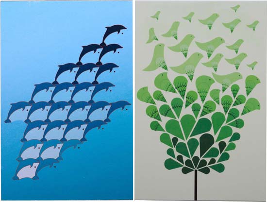
Shown here are postcards by Keith Kay Jin Rui and Candy Tan Hui Shi.

Tessellated postcards
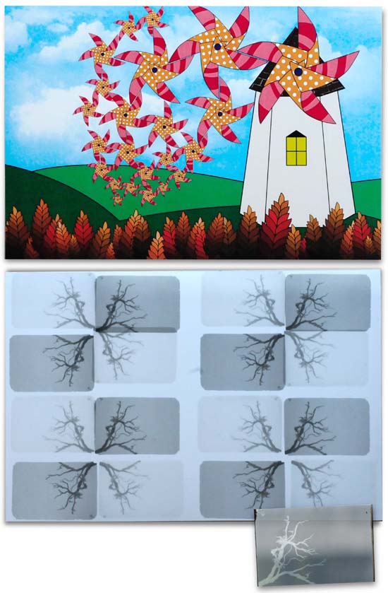
Shown here are postcards by Phang Su Hui and Alexander Budnick, an exchange student from Canada. Alexandar experimented with using the traditional black and white film to create his tessellated postcard which resulted in one that exudes a rustic and nostalgic feel.

Tessellated postcards exercises
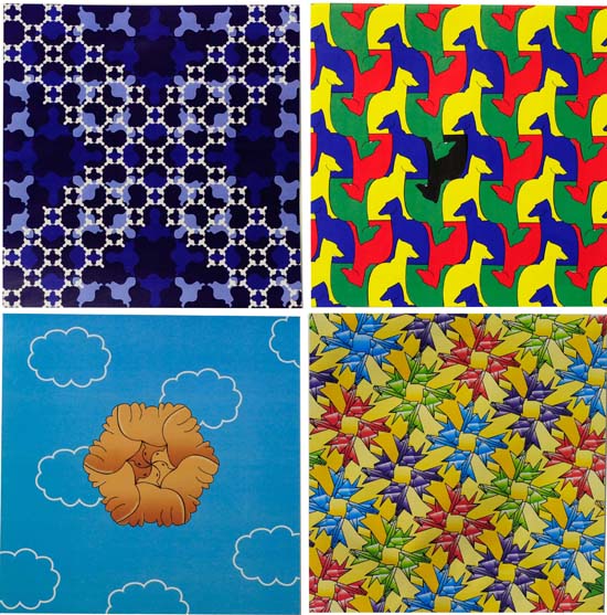
The first part of the exercise required them to create repeated tessellating images first by trying out geometric patterns and the final one by using graphical images which could be objects, animals, plants, nature etc.
Shown here are creations by (clockwise from top left) Candy Tan Hui Shi, Marlene Tan YiTing, Cheryl Cheong Wenli and Foo Hui Yu.

|
|
YEOH AS EDUCATOR
- MY STUDENTS' CREATIONS
- MY WRITINGS
Select below to view my students' awards as well as their creations from Nanyang Technological University, Texas Tech University, and Southern Arkansas University.
|