| |
Creative Visual Experience and Design Jan - Apr 2013
Syllabus for Graphic Communication (CS 2032) taught at Nanyang Technological University, Singapore Semester 2 Academic Year 2012 - 2013.
Download: Syllabus CS8070 Jan - Apr 2013.pdf

Creative Visual Experience & Design Jan - Apr 2013
This course is both a reflective and hands-on approach to design which recognizes that there is always an experience created by a product, service, event, environment and people. These interacting elements play a part in contributing to our overall experience. As a result, whether we intend to or not, our perception about a product, service or brand becomes impacted. This course seeks to orient students to the full spectrum of human experience through which the different dimensions of our environment affect us in sensorial, retail, technological, style, travel and cultural dimensions.
The course seeks to provide new insights into the dynamics underlying our individual and collective strengths and challenges in observing and experiencing the elements (objects, events, environment and people), as well as developing frameworks to help students come full circle in understanding how our day to day experiences affect us. This is done by fulfilling one major group assignment followed by an individual assignment.
Depending on the final enrollment, students are divided into groups of 3-5 per group to select from the six topics below for a group assignment. Each group must ensure that the following topics are covered/touched upon: Introduction (5%), Research components (20%), Observations (20%), Examples (30%), and Interpretation [meaning] (25%).
A colorful Experience
Six groups of students (n=28) discovered crucial visual and emotional perspectives in color and how color could be used for effective communication in the various outlet. Colors have an emotional quality that comes from either personal or cultural associations. Blue has a calming effect while yellow functions more like an attention-getter. Bright colors connote positive images, while gray or black and white are often given negative connotations.
GROUP 1: Colorful HDB (Housing Development Board) flats
GROUP 2: Colorful Cigars
GROUP 3: Colorful Power Rangers
GROUP 4: The Absence of Color
GROUP 5: Colorful Food
GROUP 6: The Colors of Fashion
A Designed World
Seven groups of students (n=25) were asked to look around their surroundings and discover how everything is a designed by someone, usually defined as a designer for a certain purpose. Design is closely affiliated with experimentation, which is as an exploratory and probing undertaking but due to the financial burden on return on investments, most are based on tried and true and are rarely true in being experimental. However, there are design experiments that are explored as a means to promote social change or as a critique of political and ethical values.
GROUP 1: The design developmental stages from Roman era to the present
GROUP 2: Shopping
GROUP 3: Gardens
GROUP 4: Ikea
GROUP 5: Books Actually
GROUP 6: Design for the Ladies
GROUP 7: Art vs. Design
Repetitive Things
Five groups of students(n=22) observed visual patterns that can be noticeably found in various topics to form a pattern-based framework to see how patterns affect the way we live, work and play. It is also a source of inspiration for new ideas to the rest who witnessed their presentation.
GROUP 1: Repetition in Product Design
GROUP 2: Repetition in Rituals
GROUP 3: Repetitive Symbolic Things
GROUP 4: Repetition in Fashion Magazine
GROUP 5: Repetition in Coffee Shops
Things Beautiful
Seven groups of students(n=34) investigated how patterns as an underlying mathematical structure, can be read as our ways to search or predict for regularities. Their direct observation in seeing visual patterns can noticeably be found in nature and in art. In art and architecture, repeated patterns are combined to form patterns that affect the way we live, work and play. Upholstery, rugs, floors, wallpaper, clothing, fabric, tile, mosaics, paintings and more are some of the surfaces that provide greater possibilities for the glorification of forms, shapes, and space.
GROUP 1: Beauty of Death
GROUP 2: Beautiful Pinnacle @ Duxton (condo-styled apartment complex)
GROUP 3: Beauty in Advertisement
GROUP 4: Perfectly Imperfect
GROUP 5: Beauty in Advertisement
GROUP 6: Beauty in General
GROUP 7: Beautiful Asian Women
Minimalistic
8 groups of students(n=32) investigated some important questions such as "Is less truly more? Is less simply just lesser? Is being minimalistic important? Is it true that being complicated is easy and being content with lesser is harder to achieve?." In design or style, a parsimonious approach with the simplest and fewest elements can amazingly create a maximum effect. If minimalism in art is achieved by stripping objects or ideas down to their elemental, geometric form, and presented in an impersonal manner, where can we find these (in Singapore, for that fact)?
GROUP 1: Minimalism in Movie
GROUP 2: Minimalism as a Lifestyle Choice
GROUP 3: Minimalistic Logos
GROUP 4: Minimalism in General
GROUP 5: Minimalistic Logos
GROUP 6: Minimalism: Dialogue in the Dark
GROUP 7: Minimalistic Foods
GROUP 8: Minimalism in General

Individual assignment by Quek Shi Min

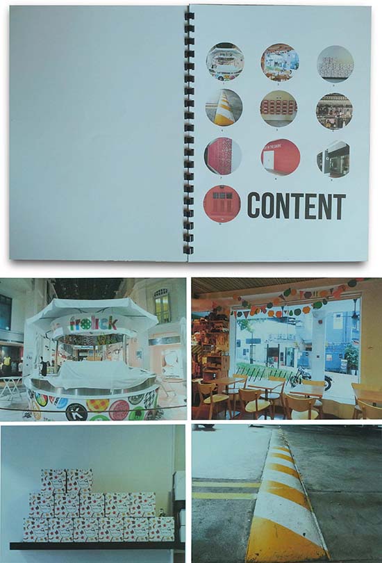
In answering Where is MINIMALISM being BEAUTIFULLY REPEATED to create DESIGN in a COLORED manner?, she presented her photos in a bound booklet with textual explanations underneath each picture (removed here for presentation purposes):
Top left: The above photograph shows the Frolick outlet at Bugis Junction. The circle shape can be observed repeated in this composition. A circle represents the "O" in Frolick, with polka dots within it, which are essentially repetition of circles. Circle with different graphics are also used in the bottom pane of the store. Lastly, the store structure is designed with circles as well, with 2 circular structures supported by three pillars. The minimal use of circular shapes creates an impactful design, along with the colors of the store. It's mainly white, and using colors only on areas where draw customers' attention is required.
Top right: This is taken from the Little Drom Store, a quirky vintage store located in Ann Siang Hill. The main focus of this photograph is the decorations hung on the ceiling. Different shapes and colors are used and yet it is a minimal design, as it comprises of just simple shapes with clean lines. The shapes are repeated throughout the design and different colors are used to add a quirky feel to it, which complement the store's image. The decoration is also a minimal way to balance out the store design, preventing this area from being too bottom-heavy.
Bottom left: This display of empty cake boxes is taken from KKI cafe located at Ann Siang Hill. Unlike how cake boxes are usually stored, they are constructed and repeatedly stacked on a shelf visible to the customers, instead of storing it folded and not within the customers' sight. KKI cafe uses their cake boxes as a form of product display and part of their store design. Functionality is minimally present in this way as they are able to present their brand name, create designed display and use the boxes conveniently when customers order cakes for takeaway, all at the same time.
Bottom right: The above photograph shows a speed hump in a car park. It is designed minimally to serve its function of grabbing a driver's attention from far, informing them that there is a speed bump ahead. Diagonal stripes are repeated in yellow and white colors to form a simple yet striking design. Diagonal stripes how change from the straight lines on the roads and the colors present a great contrast from the dull cement roads. These minimal aspects of a speed bump increase the design effort for functionality. This concept is repeated and well educated across the country as well.

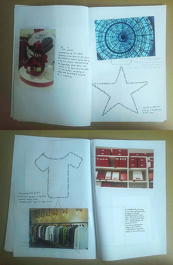
Individual assignment by Chew Jia Lin

Top (left page): Marc Jacobs presents one of his latest perfumes in the form of Dots (as is the perfume's name) by the use of only two colors: red and black. He repeatedly places these two colors in the form of polka dots on this bottle, creating an edgy and beautiful picture of a ladybug.
Top (right page, the star): I've never known how intricate the designs were until I was forced to observe every single thing around me. With the use of just metal pieces against the blue sky, repeated patterns of stars appear. Look up and you'll see stars, they say. This is coincidentally true when I was on the escalator in Orchard's Wheelock.
Text to the right outside the star: and when you tilt you head up, it enables you to see, stars.
Bottom (left page, the shirt): Beauty can also be found in fashion designs, or the way the boutiques layout their clothing to attract customers. Benjamin Parker, a clothing line that caters to male apparel lays out its products in a simplistic manner, with the use of repetition on its lighting.
Outside of the shirt: The arrangement of the colors also creates a repeated gradient design that comprises from light to dark tones.
Bottom: It's aesthetically pleasing to see files and stationeries arranged so neatly according to their color. I took this picture because red is my favorite color and I like the designs of the bookshelves. The design created here surfaces minimalism, highlighting a repetitive effect of the bookshelves.

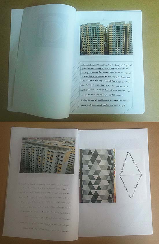
Individual assignment by Chew Jia Lin

Top: The next two pictures would portray the beauty of Singapore's first ever public housing. It would be difficult to ignore the way the Housing Development Board (HDB) has designed its flats that is now rampant all over Singapore. These HDB blocks tend to be of a single standard slab design of uniform height, typically averaging from 12-18 storeys and arranged equidistant from each other. These flats are often colored minimally to create the design of repeated squares, depicting the idea of equality among the people. This careful planning is of course, pieced together with much thought.
Bottom (left page): I really like how the pillar uses white, black and grey colors, coupled with the use of triangles to create design in a repeated manner.

Individual assignment by Chew Jia Lin

The individual assignment aims to curate images that portray the five categories which was emphasized during the course especially during group assignment. The purpose is to show how these five aspects are manifested within the chose images. The final individual assignment is a form of a photo ethnographic study which requires the students to photograph a series of 10 images from a question developed from mixing the category they once belonged to when they were clustered in a group. No "encompassing theme" was used in order to allow for broader explorations and experiences, which was done at the risk of being too vague and abstract. Care was exercised to minimize the effect of the image being vague through the use of the narrative. The images must be accompanied by an analytical description for each photo and is limited to maximum 100 words per image. There were some notable repeated observations however, like the employment of design experiences to accentuate an experience or to convey meanings beyond the physicality of the design element. Regardless, the meanings of these images covered were contextualized, qualified and interpreted in a manner that focuses mainly on the "vibe" or visceral feelings. The students are assured that although there will be notable repeated observations as each student categorically draws from their group, the meanings that these images convey will be contextualized and interpreted according to their interpretation which is drawn from their own experience. They are also allowed to place images next to each other within an image as a way to compare and contrast and the 2-in-1 image will be considered as one. However, they are advised not to re-arrange, arrange or digitally or manually manipulate the image.
Where is (the category that the student belongs to) being ______ ______to create _______ in a ______ manner.
For example, a student who belongs in the "Colorful Experience" category could possibly phrase his/her question as such:
- Where is COLOR being DESIGNED MINIMALLY to create BEAUTY in a REPETITIVE manner
- Where is DESIGN being MINIMALLY REPEATED to create BEAUTY in a REPETITIVE manner
- Where is MINIMALISM being COLORED REPEATEDLY to create BEAUTY in a DESIGNED manner
- Where is BEAUTY being REPEATEDLY COLORED to create DESIGNS in a MINIMAL manner
- Where is REPETITION being MINIMALLY DESIGNED to create BEAUTY in a COLORFUL manner
The blanks, indicated as "_______" is a series of four other blanks that when formed in a complete sentence becomes an investigative question which verbally allows for many forms of visual interpretations. The students were given the freedom to mix and match the other four different categories which they were once excluded from to form a sentence that makes sense to them. To reduce any misinterpretation, the categories with more than one word such as the "Colorful Experience," "A Designed World," "Repetitive Things" and "Things Beautiful" are reduced to one single word for the blanks.
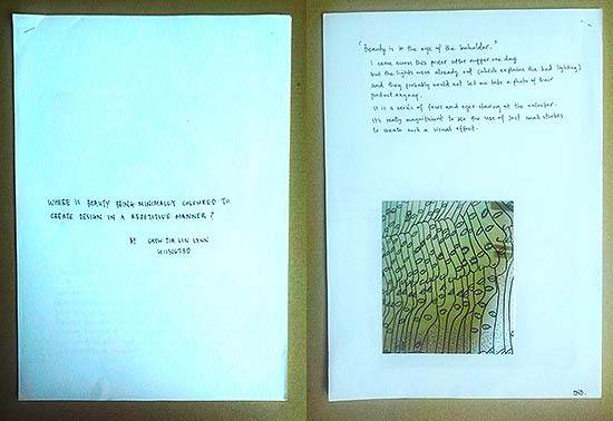
Here is a sample of an English major student, Lynn CHEW Jia Lin whose longhand approach to her report was surprisingly refreshing, especially when she purposefully arranged the text which describes her pictures in fashions that uniformly matched each other.
Left: Where is BEAUTY being MINIMALLY COLORED to create DESIGN in a REPETITIVE manner? by Chew Jia Lin Lynn
Right: 'Beauty is in the eye of the beholder.'
I came across this poster after supper one day but the lights were already out which explains the bad lighting and they probably would not let me take a photo of their product anyway.
It is a series of faces and eyes staring at the onlooker. It's really magnificent to see the use of just small strokes to create such a visual effect.

A reflective and hands-on approach to experiencing "Experience"

CS8070 is both a reflective and hands-on approach to design which recognizes that there is always an experience created by a product, service, event, environment and people. These interacting elements play a part in contributing to our overall experience. As a result, whether we intend to or not, our perception about a product, service or brand becomes impacted.
In addition to the weekly worksheets (an example from week 5 shown here) that get the students to share their observations, stories, perspectives, and even stereotypes, 40% of their final grades were dependent on a transformative experience in which they document a process which requires them to be someone they are not for 10 weeks. They will report their experience in a report with 10-20 images within 1000 words. The assignment can be a paradigm shift by becoming a person they have always fantasized about being but never have the gumption to become/explore/experiment.
Click here for a Facebook link to find out more about the course.

|
|
YEOH AS EDUCATOR
- MY STUDENTS' CREATIONS
- MY WRITINGS
Select below to view my students' awards as well as their creations from Nanyang Technological University, Texas Tech University, and Southern Arkansas University.
|