| |
Atheism: Case Against God Cover Redesign

We do judge a book by its cover. During an in-class voting between a research manual and a book about atheism, the students opted for the latter. Both books have relied on typography on their cover. The complete makeover included the front and back cover as well as its spine. Apart from the book title, author's name, other relevant information such as the publisher, bar codes and other pertinent information were included in a mock-up of the book. The objectives were to train their abilities to apply the knowledge they learned from class lectures to translate abstract ideas in combining text and images. Successfully done, this before and after assignment shall introduce new improvements on the cover that will better elucidate the controversial context of the book by George H. Smith. Refer to the top left for a copy of the original book cover design.
TOP: Linette Ong's idea behind her image was to visually interpret the word "CASE AGAINST GOD" as reflected in the title of the book. The snow globe represents the world believing that god exists and a strong literal objection to the whole idea of the existence of a supreme being is smashed into pieces through the act of slamming a mallet onto fragile surface surface. She handcrafted the angel out of clay. Originally, she planned to have a halo above the angle's head but discovered that the snow glob is too small to accommodate the halo. Another challenge in creating the image was met when she tries to photograph her composition on a background which lacks a dramatic lighting effect so after a few attempts, her cover was finalized in the computer with several attempts to find the right typefaces.
BOTTOM: Carolyn Dali Luo Lin carefully positions the crowbar to pry the nail out of the cross in her photograph that the crowbar itself becomes part of the cross. As such, the crowbar although visually a part of the cross from a bird's eye view, became a device that forces its way into removing the cross.
For the rest of the selected book covers, visit: http://www.facebook.com/media/set/?set=a.10150885615647988.431077.709322987&type=1&l=9a59385a47
Some inspirations for book cover redesigns could be found at: http://www.fostercovers.com/before_after/
http://flavorwire.com/101979/now-then-redesigned-book-covers

Atheism: Case Against God Cover Redesign

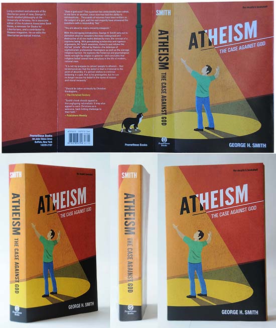
Wendy Aw Wen Ting's conceptual idea is based on the descending rays of sunlight as the suggestion of a spirituality of a higher being. From the front cover, a viewer would think that the character on the cover is responding to the high calling of God but when a viewer flips to the back, he/she would realize that the light rays are emitted from a street lamp which suggests the artificiality of religion which has been blinding many believers.
As suggested by the Gestalt Law of Continuity, lines which continue from the front enables the viewer to perceive and interpret the design as a whole. The use of bright intense colors as well as the typographic styles are rendered in propaganda poster styles which carry a strong and powerful message for the book's title. The grunge texture of the background alludes to the age-old belief of the existence of a higher being. The diagonal lines are used not only to create depth and perspective but also to add movement and lack of stability which are befitting of the author's message against existing religious beliefs.

Atheism: Case Against God Cover Redesign

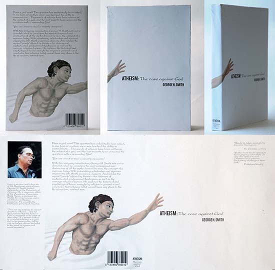
Serene Lee Si Rui's idea is inspired by Michelangelo's painting on the Sistine Chapel which depicts scenes from the Book of Genesis. In reaching out, there was a vast whiteness in nothing was the message on her cover. She painstakingly painted the character on separate sheets of A4 paper which was pieced together to simulate the frescoes which were all scanned separately to be pieced together in Adobe Photoshop.

Atheism: Case Against God Cover Redesign

Joshua Francis Conceicao's idea is based on the imprisonment of a believer being shackled by the rosary of a lock instead of the cross. The purposeful choice keeping the design to black and white further stresses Joshua's intention to suggest the "darkness" of a beguiling and dictatorial religion.

Atheism: Case Against God Cover Redesign

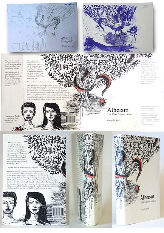
The last time Yeo Ying Ying experimented with wood print was in her secondary school years and for this assignment, she decided that the technique is appropriate. Shown here are some of her sketches and early experimentation with the print to show the coiling of the tail of a snake to form a question mark in the garden of Eden with Adam and Eve filling the back cover to complete her story.

Digital Wallpaper

East Meets West
Singapore is a modern and highly developed city state which blends cultures from Chinese, Malay, Indian as well as other ethnic groups. Due to its unique blend of ethnic tapestry with western-styled development and eastern influences, not one culture stands out indefinitely. Do you agree or disagree? The students were tasked to create a 1920 x1080 wall paper which exhibits their views. They were to experiment mainly with handwritten/photographed/crafted typefaces in the environment that seem to suggest how the east meets the west(vice-versa). The objectives were to develop your observational, analytical and compositional skills in the 4 environments:
- Beyond the city
- Neighborhood eateries
- The arts
- Shopping
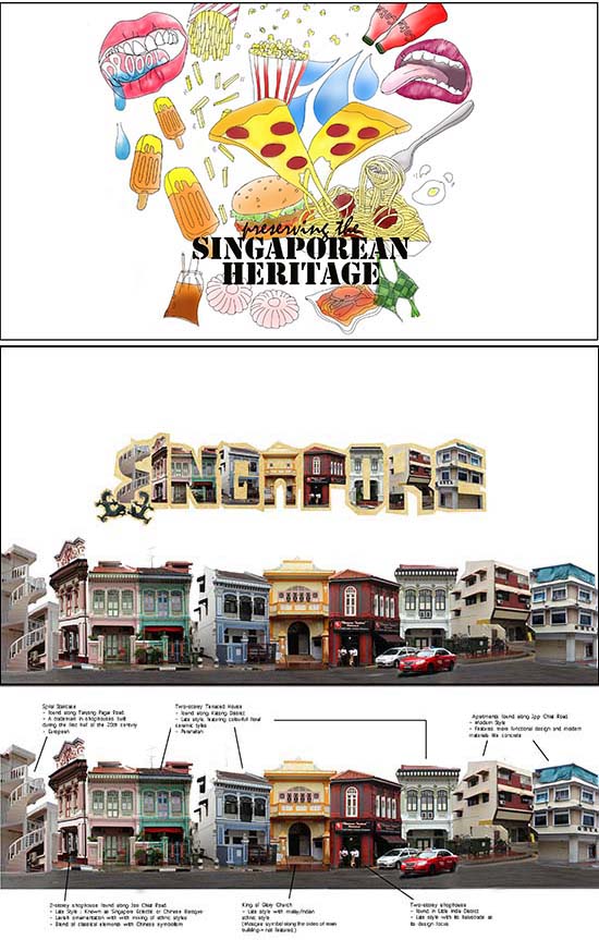
Top: Shown here is Ruby Lim You Shi's exploration of neighborhood eateries in which she felt must be preserved.
Bottom: Evonne Ong Hui Hun explored the many architectural styles found throughout Singapore and as shown at the bottom of her final work, the places where the buildings are found. She then weaved the images together to form a coherence and added the word "Singapore" made out of typographical words.
Some inspirations could be found at: http://www.behance.net/gallery/Free-Typeface-Deco-Neue/2919157
http://www.behance.net/gallery/Goverdose/4704179

Poster for Tomorrow

By exposing the toe of a torn sock, a metaphor for a well-protected home, Joshua Francis Conceicao tries to suggest that no one should be left behind in the basic needs of having a roof over our head.

Poster for Tomorrow

Ng Xi Tong carefully photographs her friend who models for her poster and by using an image editing software, she creates the silhouette of a home which is in fact, a shadow from the umbrella which provides a limited shelter for the person who is craving for a home.

Poster for Tomorrow

Yeo Ying Ying's idea is about the simplistic mind of a child's drawing wishing to reach outwards and towards the sky which is limited by the absence of a home.
Farah Diyanah's idea banks on a blue print which instead of showing where each individual area is carved out for its designated purpose, suggests what each space could potentially become.
Ruby Lim's idea is deliciously clever. Everyone is entitled to a slice of the cake and the decoration on the cake is a direct representation of a home for everyone while Carolyn Dali Luo borrows the cutesy dolls from the Sylvanian families, a line of collectible anthropomorphic animal figures created by a Japanese company. Instead of the bad wolf eating the 3 piglets, they are living happily ever after.

Poster for Tomorrow

Wendy Aw Wen Ting's poster, created as part of an assignment in my Graphic Communication course (with a proof of submission) was selected as one of the 100 posters from the organizers of Poster For Tomorrow with the theme "A Home for Everyone". Her winning entry is the only representative from Singapore. Congratulations, Wendy!
For a complete listing of all the top 100 designers, click here.

|
|
YEOH AS EDUCATOR
- MY STUDENTS' CREATIONS
- MY WRITINGS
Select below to view my students' awards as well as their creations from Nanyang Technological University, Texas Tech University, and Southern Arkansas University.
|