| |
For more typography with Chinese flavors...
Post Date : 2015-09-14

Doubled typography
Post Date : 2015-04-30
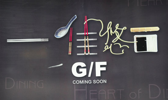
An about to be opened restaurant in Hong Kong which incorporated elements closely associated with the nature of the business such as chopsticks, spoons, noodles and so forth, this sign is both fresh, contemporary and artistic.

Doubled typography
Post Date : 2015-04-30
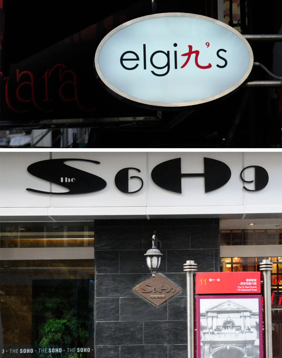
These two signs very much reflect the scarcity of space in Hong Kong whereby even signs have to co-exist and blend seamlessly with each other. The "n" in Elgin's (a bar) Central was written in the Chinese character of 九 (number 9) while the coma was actually constructed from the number "9" itself. Brilliant!
Another sample came from a restaurant called Soho also in Central whereby the address number was being incorporated into the "O"s in Soho. The typestyle was carefully chosen to have a roundish shape for a harmonious look. Another brilliant solution.

The art of tea
Post Date : 2015-04-30

The folks at Jingming hotspring holiday resort in Teochew, Guangzhou, China had found a way to express the many facets of tea ceremony via calligraphy, which in this case was carved directly into the hard surfaces of the surroundings. The same character of tea 茶 could be written in so many ways thanks to China's unbroken history of its written language, although the Communist government simplified over 2000 characters, some simple characters remain intact such as this one.

Never enough endorsements
Post Date : 2015-04-30
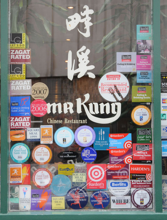
Upon close inspection, this Chinese restaurant in London named Mr Kung is a must-visit. After all, it has all the endorsements from food critics, magazines, chefs, etc. Are we so numb and desensitized that we can no longer form of our opinions but to listen to people who decide for us? Unfortunately, it seems the case because deciding needs processing power and most people are not willing to exercise that.

Calligraphic building
Post Date : 2015-04-30

Located near Taipei's Chongqing Street, this restaurant cleverly uses poems of Li Bai, Chinese poet from Tang Dynasty (618 - 907) as its facade giving the restaurant a modern yet classic feel. Li's interactions with nature, friendship, love of wine and acute observations of life inform his best poems and he was part of a group of Tang Dynasty scholars known for their love of alcoholic beverages.

Danger in Taiwan airport
Post Date : 2015-04-30

This warning poster in Taiwan's Taipei Taoyuan airport cleverly features the Chinese character of 危 (wei) by incorporating all the prohibited items. Chinese character itself is full of semantic information and this treatment further adds a recognizable element to the character.

Expo 2010 Shanghai China
Post Date : 2015-04-30
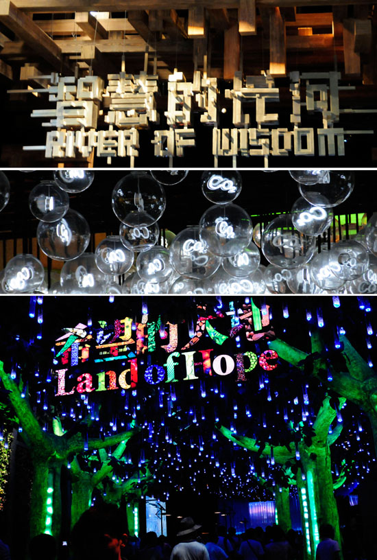
Using energy-saving LED technology, these typographic artworks from the China pavilion in Shanghai during the Expo 2010 Shanghai China exposes not only China's economic might but also her creativity in rendering themes that are well complemented by typographic creations that punctuate the messages within.

Expo 2010 Shanghai China
Post Date : 2015-04-30
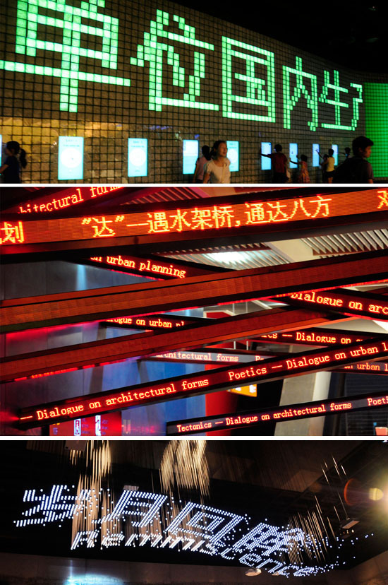
Thematically stylized typographic creations utilized throughout the China pavilion from the Expo 2010 in Shanghai in 2010.

Expo 2010 Shanghai China
Post Date : 2015-04-30

Designed by the Cirque de Soleil folks, these typographic works in this pavilion belongs to Canada. Through these "peep" holes are sometimes used by the working personnel carrying Canadian flags to "tease" kids. In addition to beautifully decorated interiors, they also feature projected words onto the floor.

|
|
YEOH'S JOURNAL
|