| |
Indiana University Southeast Typography Jan - May - 2017
Syllabus for Syllabus for a Typography course (S351), Indiana University Southeast, New Albany, Indiana, USA for the spring semester from Jan - May 2017.
Download: S351 Typography syllabus - spring 2017.pdf

1st exercise: Animated type

Saul Bass is a famous graphic designer whose work from the 1950s and 60s was best known for film posters and title sequences. Typeface designs used in film titles can set a mood to capture an audience before a movie started. Drawing inspirations from Saul Bass' signature style of simple graphical elements, bold typestyles, and simple backgrounds, the students are tasked to create a flip book that is predominantly type-driven with minimal photographic images. They will experiment with typographical repetitions on each frame to create the illusion of motion through a flip book sized at 2.5" x 4" (totaling at least 40 or more sheets).
Many thanks to Jessica Thomas, our fabulous student advisor for the School of Arts and Letters for flipping the book while its being photographed.
Download a sample of work from Hope Kaiser's Shawshank Redemption.
Download: HopeKaiserFlipBook-1.gif

2nd exercise: Typophobia

In exploring the mixing and matching of typefaces through the scaling of type, line spacing, kerning, tracking and alignment within a given grid structure, the students are asked to research for a phobia in http://phobialist.com/ and to pick from a list of phobias that best describe a phobia that intrigues them. Then, they created a typography-based diptych measuring 8" x 8" for each panel. The exercise required them to research the conditions and the design solution must emotionally convey the intensity of the conditions through careful arrangements of type, color, textural background and applications of principles of design such as alignment, balance, contrast, emphasis, unity or repetition.
The panel on the right is a succinct description of the phobia and the second panel is about visually suggesting the fear via typographic manipulations to typographically describe the phobia. As this is a diptych, they must ensure that both panels are consistently stylized to match each other, despite the different content that each panel carries.
Shown here are works (from top) of Felicia Hill, Jessie Martin, Hope Kaiser, and Ryan Heacock.

3rd exercise: Wayfinding for a Farmers Market

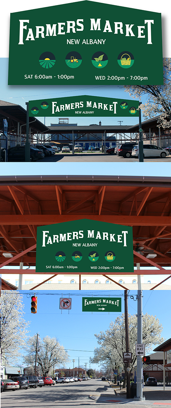
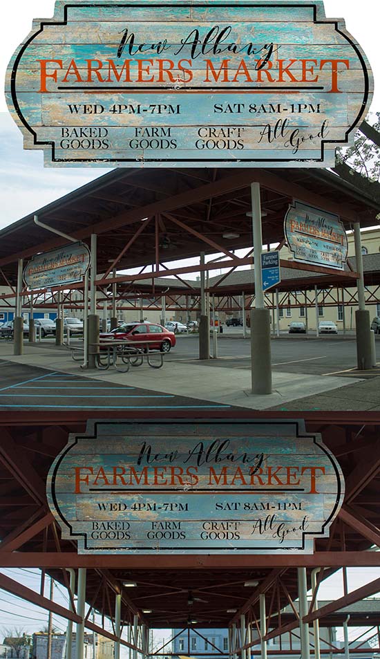
Similar to the exercise that started in the fall semester of 2016, the students were encouraged to customize digitally available fonts for a wayfinding project for a local farmer's market. Borrowing characteristics of display type, they are to create or customize typefaces for New Albany's "Farmers Market" in Indiana to capture the 'essence' of the market. While they will eventually use the computer to assemble the pieces together, the exercise requires them to create by experimenting with hand lettering.
Their idea must be visually tested for a realistic-looking environment which requires them to photograph the market from three angles: the front of the market's entrance, the side that shows their signage on the side of the market and finally, one that is far away to test the visibility of the signage. Ideally, the pictures are shot to allow signage to show as little tilting as possible, cropped to remove unnecessary background distractions, shot on a bright day and not blurry in appearance. Shown here is the work of Hope Kaiser.

3rd exercise: Wayfinding for a Farmers Market

Jessie Martin's idea for New Albany's Farmers Market.

3rd exercise: Wayfinding for a Farmers Market

Felicia Hill's idea for New Albany's Farmers Market

4th exercise: Design our own font
The objective of this exercise is to identify 26 letters of the alphabet (both in majuscule and miniscule forms) as the student's personal typographic expression in which he/she will create their own typeface via myscriptfont.com.
As it is based on their own handwriting, the font he/she will create is mainly a casual or informal scripts that reflects their personality. As such, the informal scripts that the student creates will be devoid of traditional anatomical requirements (such as serif, counter, spine, counter, finial, cross bar, or terminal) but they must not overlook the most important requirement for the effectiveness of a font: legibility.
In order to complete the assignment in a more professional manner, we will use Adobe Illustrator/Photoshop mainly just as a tool to clean up or tidy their handwriting. It is particularly helpful especially in creating the medium, bold or extra bold versions (Total 4, inclusive of the original plus three variations). However, they are to avoid using any readily available typeface from the internet. Doing so will earn them a zero for the assignment. Explore not just the miniscule and majuscule forms of the alphabets, they are also to add numerical and other symbols.

5th exercise: Who I am!
Inspired by an unconventional format of innovative book by a band, a clothing label, a website, a record label, a design team, the book by Chicks on Speed (COS), Chicks on Speed: It's a Project, we will attempt to typographically replicate the innovative format. Produced in 2004, the book still is amazingly one of a kind with jagged sides, sections of the book being cut in a different manner. We will use their approach to answer "Who Am I," essentially a set of 40 questions broken into four areas as content for a booklet. The true essence of the book will come from the answers in the questionnaire that you must complete before embarking on the design process.
Together with the combinations of relevant and supportive graphics and images, ideate, produce and deliver a 12-page (3 sheets) layout and eventual binding into a booklet which includes front and back covers with subsequent pages within. The essential gist is to use the question: "Who Am I?" and visually turn it into "Who I Am!" as a visually typographic compass to generate content for your layout. The content of the pages is based on Environment and People, Behavior and Action, Knowledge and Skills and Assumptions and Beliefs. You may also choose to experiment with Xerography.
This exercise is about the application of your knowledge of the physical makeup of type, specifically its characteristics such as family, style, case, weight, size, position, color and treatment, in a rather unconventional way. However, we will work within the perimeter of 11" x 17" for the ease of printing.


|
|
YEOH AS EDUCATOR
- MY STUDENTS' CREATIONS
- MY WRITINGS
Select below to view my students' awards as well as their creations from Nanyang Technological University, Texas Tech University, and Southern Arkansas University.
|