| |
Indiana University Southeast BFA Graphic Design Jan - May - 2017
Syllabus for a senior-level BFA Graphic Design (S452), Indiana University Southeast, New Albany, Indiana, USA for the spring semester from Jan - May 2017.
Download: S452 BFA GD syllabus - spring 2017.pdf

1st project: Promote things with graphic design

The career path for graphic design is broad, ranging from Graphic Designers, Typographers, Packaging Designer, Publication Designers, Production Supervisors, Art Directors, Account Executive, Display Artists, Animator, Web Designers, Art Teacher, just to name a few. Inspired by Pentagram's Michael Bierut who wrote, 'How to...,' we will investigate four areas in graphic design: How to sell, how to explain, how to make things look better, and how to make people laugh or cry with graphic design. Bierut is one of the 21 partners in Pentagram, a leading multi-disciplinary design firm that specializes in graphic design, architecture, and industrial design with offices in London, New York, San Francisco, Berlin and Austin.
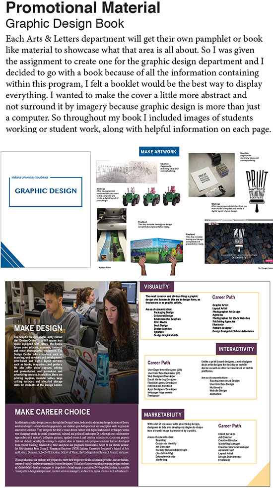
For the first project, the students were tasked to create a promotional material for promoting the IU Southeast graphic design program. The samples provided are for reference only. With the objective of attracting and informing prospective students, the visual-driven brochure is a print-based format which includes the following--description about the graphic design program, student portfolio, mention of the Design Center, equipment, etc.
A limited run of 200 copies of a final design will be chosen for printing. Text and images will be provided but the students are also expected to create or obtain other images that are supportive of their concepts. The format is only limited by your imagination in which by the governing laws of productivity, the booklet can also be foldable poster, a trifold, an accordion fold, etc. Unless stated otherwise, you are expected to prepare in addition to their completed project, a series of 2 to 3 images showing their artwork photographed on a background for portfolio purposes.
Michael Bierut is the definition of what excellent graphic design can do.

2nd project: Explain things with Graphic Design

The idea of an infographics is to communicate complex data into information that can be easily understood in visual forms. Using publicly available data or social awareness issues, we will create take complex information and present them as graphics (through the combination of pictography and typography) meant to educate or inform the public. There is an opportunity to earn extra credit for this course through this project. Refer to grading criteria in the following page. As this is a BFA course, you have the option to select from the possible areas of explorations below:
- Medicinal packaging (with instructions on the inside and outside)
- Information graphics (editorial, a magazine spread, an event)
- Interactive media (website or animation)
- Environmental graphics (signage, signage systems)
The eventual format is dependent on the purpose, be it as an editorial, description on a label, an advertisement in a publication or a spread in an annual report.
Objectives:
- To make information accessible for stakeholders by distilling information into a visually-based format for easy comprehension.
- To visually explain things by experimenting with a combination of timeline, charts, bars, graphs, analogies, metaphors, and storytelling.
Shown here are information graphics by students Addison Millea and Daniel Vance where the former explains about the the first Aston Martin car that was used in the James Bond franchise of "Goldfinger" shot in 1964 all the way to "Spectre" in 2015. The latter was Daniel Vance whose interests in comics created a chart to explain how a comic which has an adaptation of a Super Hero typically began from the script to a film adaptation.
References:
Data and Statistics about the United States.
The Huffington Post Education Statistics.

2nd project: Explain things with Graphic Design

Shown here is Emily Thompson's information graphics for a stress free guide for college students.

3rd project: Make things look better with graphic design

For your 3rd project, they are tasked with designing a thematic package that holds a credit card issued by a fictitious bank called ABC Bank. The package should primarily contain a pocket or a die cut of some sort to hold a credit card, designed to deliver the credit card plus other marketing message contained within a promotional package which can be mailed by regular postage. To correctly reflect the requirement in your design, you must investigate the allowed size or options approved by the postal office. Refrain from using lorem ipsum text for body copy.
Apart from an aesthetical appeal, the package should ideally invoke the true intention of the card: attracting new applicants to sign up whereby the more they charge, the more the will get cash incentives. The targeted audience dictates your design-- from the format, style, content, and graphical elements. Our targeted audience will be PMEBs whose personal incomes are estimated at $5,000 and above. PMEB stands for Professionals, Managers, Executives and Businessmen.
The following elements must appear on the credit card:
- The "ABC Bank" logo. Feel free to work some personalities into its bland name.
- The words "CASH BUILDER" on the front of the credit card
- The student's name as the card holder's name
- MasterCard/Visa logo
- 16 numbers in its dimensional forms (although we are only to mimic it without embossing it),
- "MEMBER SINCE 00" "VALID FROM","GOOD THRU"
- Security chip on the front of the card
- Legal information/f as well as the magnetic strip.
Objectives:
- To creatively apply packaging methods through the combinations of graphical, pictographic and/or typographic treatments, primarily as a persuasive marketing material for a targeted group
- To generate marketing materials using graphic design methods and techniques for the purpose of substantiating a marketing message for the sake of persuading an intended purpose.
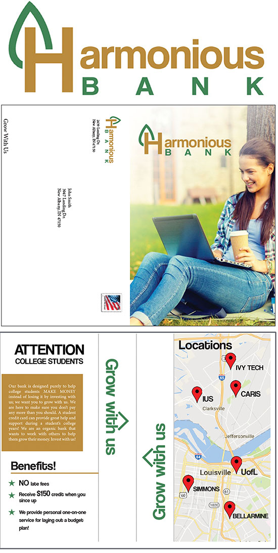
Emily Thompson's design is based on a fictitious bank she named Harmonious Bank with the motto: 'Grow with us' which banked on the idea that the bank's current promotional material is solely for college students and to help them balance their money while also helping them grow with the bank.

4th project: Getting hired with graphic design

An attention-getting approach to marketing your creativity, skillsets, and problem-solving capabilities is important because potential employers go through lots of resumes and only outstanding ones get noticed. The final project is a pragmatic and functional project which involves creatively designing a non-conventional resume. We are not simply limiting your idea to a piece of paper which highlights your educational background, employment experience, software knowledge, but possibly, in addition, a presentation format that showcases your portfolio for employment or freelancing possibilities. The idea is to get them to create a presentation package that will put the student that much closer towards career development as you prepare to graduate from the program. They will work closely with the professor to come up with a project that is uniquely a reflection of your skillsets, creativity and expertise.
Objectives:
- To create a creative resume package that showcases the student's qualifications, knowledge, skill sets, work experience, and so forth.
- To apply the knowledge of mainly a type-design design with font selections, typographical conventions of leading, kerning, tracking, paragraphing, text alignments and so forth.
Shown here is the creative resume by Daniel Vance who has trained himself to blend the unique designs of his illustrative skills with the layout of a newspaper.


|
|
YEOH AS EDUCATOR
- MY STUDENTS' CREATIONS
- MY WRITINGS
Select below to view my students' awards as well as their creations from Nanyang Technological University, Texas Tech University, and Southern Arkansas University.
|