| |
Indiana University Southeast - Graphic Design I Aug - Dec 2017
Syllabus for Graphic Design 1 (S250), Indiana University Southeast, New Albany, Indiana, USA for the spring semester from Jan - May 2017
Download: S250 Graphic Design 1 syllabus revision 2.pdf

1st project: The Processes of Graphic Design
Our first project consists of a series of four weekly assignments that are due at the times specified in the schedule. These assignments are designed to expose you to four different areas of design: typography, compositions, mock-up (prototyping) and the factorial sides of graphic design. The students are expected to keep a documented process showing evidence of the evolution of their ideas from sketches, refined sketches, and color explorations to the final product in a 1/2" or 1" black binder for every project in this class. You may also document screenshots showing your ideas as they evolve.
Objectives:
To introduce students to the processes of graphic design from researching, sketching, refinement, and production.
To inculcate an efficient and professional learning model that can be applied to the rest of the other projects throughout the course.
To expose students to important elements and principles of design where composing with text and images are understood from a contextualized viewpoint.

2nd project: Book jacket

On what basis do we decide what is cute? As a designer, it behooves us to understand those defining qualities. For this project, we ask, "How do we define cuteness? What is cuteness good for?" Psychologists have suggested that cuteness triggers emotional bonding and nurturance in parents. We explored proportions and characteristics associated with theories by an Austrian zoologist, ethologist, and ornithologist, Dr. Konrad Lorenz who linked cuteness to evolutionary biology by proposing the concept of kinderschema, the set of traits that we identify as cute and adorable to create a book jacket for a children's book. The students could freely pick a relevant size, think of a title for the book. A fictitious publishing company logo is also part of this project.
Objectives:
To expand the student's awareness to other areas such as human emotions in order to express the idea of cuteness.
To create original artwork and to apply it to a book jacket.
To work on the idea of white space, layout, grid structure and compositional elements that deal with proportions to emulate the idea of cuteness for an intended audience.
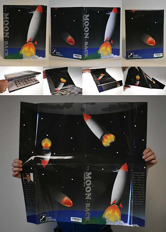
Shown here is Aaron Williamson's take on a book jacket centered around the theme of a space exploration where the cover unfolds to reveal a poster printed on the back of the cover.

2nd project: Book jacket

Shown here book jacket designs by Victoria Klotz, Emma Howie,
Hailey Castetter, and Jordan Reidinger


3rd project: Packaging

In a consumptive marketplace where consumers' interests can be heightened, your 3rd project is about creating a structural packaging to protect the product which also serves to bring out the best features of the product. Include a self-created logotype for a fictitious company. You will be randomly assigned an everyday object. Using this object as a product, you will create a packaging that will bring out the best feature of the object through clever usage of photographic images, relevantly attractive colors with persuasive and succinctly written copies of the text to accommodate the product on a packaging. You are expected to use photographic skills, lighting, and relevant software to create a digital layout before producing a physical mock-up for the packaging. Information pertaining to the product such as its size, descriptions, features, barcodes, and manufacturer's contact must be included.
Objectives:
To study the attractiveness of a product and propose a structural element which serves to protect and advertise the product's features.
To use photography primarily as a persuasive image-based message for the intention to 'sell' the message to a targeted audience.
To design and fabricate a structural design element that deals with three-dimensionality (front, top, bottom, back and sides)
Shown here are designs by Alma Perez and Nathan Neutz.

3rd project: Packaging

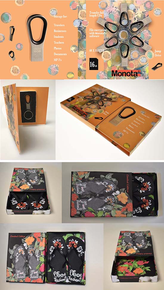
Shown here are designs by Victoria Klotz for a thumb drive and Briana Dixon's for a pair of limited edition flip flops.

4th project: Signage

The students were asked to think of an environment that communicates, in this case, the facade of the Ogle Center which shares the same building with the School of Arts and Letters at Indiana University Southeast. The project offered the opportunity to create signage (environmental Graphic Design) for the Ogle Center which serves as a theater, community center and concert hall for various performances. This project involves aspects of typography, imagery (if applicable), color, form, content, architecture, industrial and landscape design. The word 'Ogle Center' and 'Knobview Hall' must be present in the design.
Objectives:
To introduce students to brand strategy with opportunities to explore ideas associated with branding, visual identity and wayfinding design;
To work in groups as a transformative experience to connect with other fellow students as well as understanding the wider environment in which an organization operates; and
To appreciate the process of design and the planning details in executing a campaign, including mastering the necessary skills associated with the presentation of ideas.
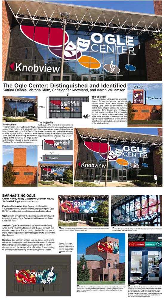
Shown here are works from two groups of students:
Top: Katrina Dennis, Victoria Klotz, Christopher Knowland, and Aaron Williamson
Bottom: Emma Howie, Hailey Castetetter, Nathan Neutz, and Jordan Reidinger

4th project: Signage

Top: Hayden Robb, Courtney Ross, Olivia Wise, and Alma Martinez
Bottom: Brianna Dixon, Miranda Morris, Jakob Lind, and Joey Sirohman.

5th project: Branding

In this day and age of global trade where corporations and humans alike yearn to be recognized for who they are and why they matter, it behooves us to think about brands like FedEx, Nike, and United Airlines (for that matter of the treatment of their customers) and how they have become known for their corporate cultures. They recognize the importance of defining and articulating their promises. Our last project is the concept of branding and through the idea of integrated branding, applying concepts of branding through a logotype design project to a lesser known country. You will also consider the U.S.P. (unique selling point) of the country through a tagline.
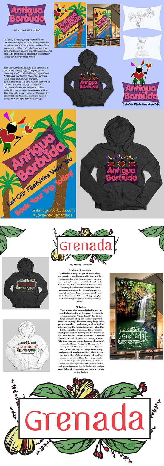
Shown here are works by Jakob Lind for Antigua and Barbuda and Hailey Castetter for the country of Grenada.

|
|
YEOH AS EDUCATOR
- MY STUDENTS' CREATIONS
- MY WRITINGS
Select below to view my students' awards as well as their creations from Nanyang Technological University, Texas Tech University, and Southern Arkansas University.
|