| |
Parkway-Guadalupe Neighborhood brochure

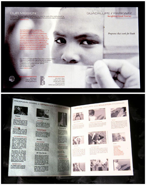
A finalist for the Parkway-Guadalupe Neighborhood brochure project in the fall of 2001, the design direction chosen by student David Zarazua was reflected by the simplicity in the design layout aided by photographs shot by student. The compositions of his pictures were carefully planned, chosen, well-cropped, and the end result was one-fold brochure that able to "tell stories" through the stares of the children's eyes.
All information was hierarchically placed in grid systems that made up the inside layout of this brochure. Colors were limited but yet the subtlety of the type, the position of the photographs work hand in hand in enhancing each other, resulting in a well-organized and easy to read design layout.

Operation USA

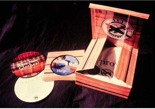
It has always been a fine line to walk between balancing a budget but to compromise a good but expensive design solution. Student Jennifer Holcomb deliberated over the issue and decided to take on a non-profit organization located in California for an assignment during the fall semester of 2001 in the Public and Social Service course. The student were given a list of organizations to choose from. The project included a custom printed box to resemble a crate that is dropped from flyover planes. Within the box lies a front and back printed T-shirt with solicitous materials such as a 4-color, multi-page brochure and circular handouts. The justification for the high cost of production was balanced by corporate sponsorship, which the box is targeted for.

Tibetan Aid Project

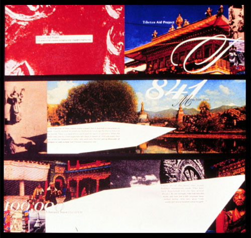
After researching and understanding the plight of the Tibetans, student Allyson Keeling from the Fall 2001 semester of the Public and Social Service course (ART 4381) decided to introduce a protruding and "uncomfortable" element in the composition by juxtaposing a sharp, obtrusive white, blade-like text box within this publication design to suggest the outside force of the Chinese communist occupation of Tibet.
To encourage citizens who mostly live in apartment housings in Singapore who have over the decades become apathetic and isolated to their neighbors, Lee Yee Ching decided to use the plant as a metaphor to spread the message to get connected.

National Asian Pacific American Legal Consortium

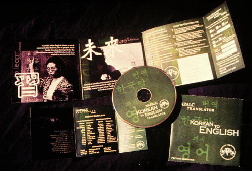
New immigrants often find themselves in a cultural shock and the mission of NAPALC was to help make the transition smoother into the United States. Their mission was also to advance and defend the legal and civil rights of Asian Pacific Americans. A promotional package for the NAPALC featuring a translator CD, a CD sleeve, a catalog, and a measurement conversion chart sheet is Green is chosen to reflect serenity in Asian. The student, Kimberly Dabbs from the Fall 2001 semester at the School of Art, Texas Tech University where I had taught at, explored different typefaces in different languages and they were used as a background to convey as sense of Asian pride and recognition in the design.

|
|
YEOH AS EDUCATOR
- MY STUDENTS' CREATIONS
- MY WRITINGS
Select below to view my students' awards as well as their creations from Nanyang Technological University, Texas Tech University, and Southern Arkansas University.
|