| |
One Condoms Design Contest

As part of my efforts to expose my Singapore students from constantly engaging tried-and-true methods as well as challenging stereotypes, they were presented with a topic that may be an uneasy one to deal with safe sex. Their final submissions were tested on a world stage whereby their designs must be submitted to the US-based One Condoms Design contest on Nov 30, 2010 and the online voting period is from Dec 1, 2010 to Jan 31, 2011. The last day of our class happened to be the day before Dec 1 which coincides with World AIDS Day. As a result of this, freshman Cheung Kai Dick wrote, "Firstly, it's my first time taking part in an actual design competition, much less an international one. Secondly, it's simplicity really gave me a lot of room to express myself. ... I felt liberated that I now had the ability to translate the ideas in my head onto paper, and that it would actually like what I had in mind."More about the competition here.
LEFT: Bobby Chan Yi Hern's idea is based on a congratulatory message to the user of this condom packet for having successfully reached the stage of a "quest". Notice the pun visually disguised on the steak being well done.
Testosterone is the chemical within us that fuel our sexual drive. Coincidentally, the chemical ends with "ONE" and Bobby's models for this design are based on actual chemical symbols and structures of the compound.
MIDDLE: By incorporating a familiar clapboard commonly found in the film industry, Ng Sie Yen's design applies an intended pun in the phrase "take ONE" whereby the audiences are being reminded that with every passionate scene, ONE offers the best precautionary measures for them.
The black panther in Sie Yen's illustration is a symbol of sensuality with a tinge of wildness. Crouching in the midst of a dense forest, the panther exudes quiet patience as it searches for a prey with its compelling gaze. Notice the phallic suggestion of the coconut tree in the background.
RIGHT: Angela Han Shiyun's design incorporates a playful and suggestive message. A slang for the word "penis", the cock dominates about 2/3 of the area, covering part of the letter "e" in "huge."
For the next design, Angela's design is derived from the "like" button found in Facebook to show their satisfaction or approval of something they like. In Facebook, upon clicking the "like" button, a message of "You like this" would appear. The tagline cleverly adds the ONE logo into the phrase.
See all of the students submissions here.
15 extremely creative condom ads.

One Condoms Design Contest

LEFT: In 1971, John Lennon and Yoko Ono paid for 12 billboards in 12 cities around the world which declared "WAR IS OVER - IF YOU WANT IT," as a protest against Vietnam War. The message is now being translated into 100 languages. Audrey Tsen Si Jia adapted the message and changed it into "AIDS IS OVER...," similarly a call against one the biggest plagues of the 21st century. The appearance of the text has been retained as homage to the original campaign.
Audrey's design is a tongue-in-cheek play on the alternative use of condoms that they can be stuffed, twisted, catapulted and inflated. The image of a blow-up doll adds hilarity to the message while the use of bright colors and Bend-day dots in the background create a pop art effect which makes the design lively and fun.
MIDDLE: Siti Maziah's design uses a phallic and suggestive image of an ice cream cone, resembling the completion and gratification of sex through the metaphor of a delicious and satisfying treat. Bright yellow is used for a cheery, summer feel to complement the image.
"One Time" is an expression used by poker players in the hopes of seeing a desired card to win. Using the circular shape of a poker chip for a condom packaging, this design links the idea of chance in a poker game and the possibility of unwanted consequences from indulging in unprotected sex.
RIGHT: Cheung Kai Dick's design is a play on the male obsession with bedding women. With a short, sharp and clear punchline, the message is reinforced with hard and solid typography, which is starkly contrasted against a plain white background.
For this design Kai Dick visually links the letter "O" in the ONE logo with the egg during copulation to reinforce the idea that ONE Condoms is a reliable brand that not even one sperm could infiltrate the egg.
One Condoms Design Contest

LEFT:In Xu Yuanduan's design, the text become laden with multiple meanings. Firstly, in "get some", a message with a sexual connotation or simply by putting it bluntly, "get some sex." Secondly, "the some "one" with the ONE being the brand name of the condoms. Finally, by combining the two entities, the message reads "Get someone".
MIDDLE: Joel Chin Gai Xuen's design juxtaposes the colorful simplicity and childish naivety associated with color pencils a singular phallic symbol created by the black pencil for visual contrast.
RIGHT: In Nashita Kamir's design, choosing "ONE" has two meanings. One is a persuasive statement asking the user to choose between the two options: have a baby or have protected sex. The message is reinforced by the visuals of a pacifier and a condom respectively.
All the students creations are exhibited outside the main lecture theater on the 1st floor at the Wee Kim Wee School of Communication and Information from Dec 2, 2010 - January 2, 2011.
One Condoms Design Contest

The screen capture of Ng Sie Yen's One Condoms Design contest submitted online.
A set of door hangers

Designed as an academic project by Nashita Kamir, these door hangers for the Hard Rock first and foremost must function as a playful door hangers disguised in squarish vinyl cover to reflect the musical nature of the hotel. On the right front of the cover, a spinning device invites hotel guests to spin for either one of the messages to appear at the top: "Please do not disturb" or "Room Service Required". With a simple flip on the back to remove the flap on the back, this playful souvenir turns into a door hanger instanteously.
(Aug - Dec 2010)
A set of door hangers

Audrey Tsen Si Jia's solution for a set of door hangers for Wanderlust Hotel, a boutique hotel in Singapore called for a solution that harked back to the 1970's. To reflect the hotel's quirky and vintage decor, her door hangers resembles the "potong" ice cream from the 70's that Singaporeans have come to love. Available in two flavors: sweet corn and red bean the door hangers also double as a luggage tag that can be easily attached to any handle. The door hangers bear the words "ssshh" for do not disturb and "service" for room service/housekeeping.
(Aug - Dec 2010)
A set of door hangers

TOP: Symmetry and opposition; black and white; hard and soft; East and West; Fluid and Rigid. These are Xu Yuan Duan's ying and yang design solution for a set of door hangers that creatively incorporated the oriental essence of the Orchard Mandarin Hotel on Orchard Road in Singapore. The iconic Chinese symbol represents symmetry built on polar opposites. The message seeks to convey that for a Zen-like stay, the environment must provide a combination of privacy and clean environment. In doing so, these designs further reinforce the hotel's branding and identity.
BOTTOM: Ng Sie Yen blended the essence of hotel in Art Deco-inspired designs for her door hangers for a hotel in Chinatown, Singapore. For a touch playfulness, the character in the design makes up her face while the instruction displayed for housekeeping remained the same message to reduce the tone of the directive.(Aug - Dec 2010)
Quote of a famous person
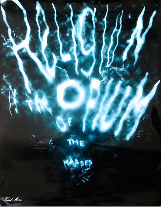
Karl Max's famous quote, "Religion is the opium of the masses" was given a hazy visual treatment, contrasted with a mysterious black background by student Xu Yuanduan.
(Aug - Dec 2010)
Quote of a famous person

Through the chosen quote of a famous person- dead, alive or fictitious, Nashita Kamir literally turned Mahatma Gandhi's "An eye for an eye makes the world go blind" into a Brailled-based visual solution to reflect the character (protagonist's) meaning in her composition. Also shown here are some sketches explored before the final artwork was painstakingly produced by using manual hand embossing.
Below was Chan Yi Hern's interpretation of Winston Churchill's "Jaw Jaw is better than War War."
(Aug - Dec 2010)
Quote of a famous person

Victor Hugo, the French writer and political activist wrote that "An intelligent hell would be better than a stupid paradise" in his Novel, "Ninety-Three". Because of its strong religious connotations, student Audrey Tsen Si Jia chose to use the design of a stained glass window commonly used to decorate churches. The quote also alludes to Adam and Eve in the Garden of Eden, the so-called "stupid paradise". The forbidden fruit of apple embellishes the window attempts to bring a biblical scene to the viewer's mind. the black background accentuates the color of the stained glass and the light beams streaming through the window are a metaphor for illumination.
(Aug - Dec 2010)
Drawing A Tree

Inspired by Bruno Munari's "Drawing A Tree" on the premise that "the branch that follows is always slenderer than the one before it", students in COM 232 interpret what a tree is like in the various indicated positions on the provided worksheet. This is one of the many weekly exercises executed in class during tutorial sessions meant to constantly sharpen the students' observations, thinking and drawing skills.
Sample above provided by Ng Sie Yen.
Growing and Shrinking

Using the word "GROW" (all uppercase) and "SHRINK", this exercise is about experimenting with heights to create various effects that suggest growth and shrinkage. By differing sizes, the students learn how to create focal points and a hierarchical order, you can create the illusion of movement.
In part II, they develop a series of playful characters based on typographical explorations using letters, numbers and mathematical symbols based on their name. They have to pick a typeface and mimic the appearance of the chosen type to spell out their name. Then, explore with the type manually to create a series of three playful characters.
Samples by Ng Sie Yen.
|
|
YEOH AS EDUCATOR
- MY STUDENTS' CREATIONS
- MY WRITINGS
Select below to view my students' awards as well as their creations from Nanyang Technological University, Texas Tech University, and Southern Arkansas University.
|